Someone lands on your nutritionist homepage after a search, a referral or a link in your Instagram bio. Before they read a single paragraph, they are already asking a few quiet questions: Is this for me? Can she help with my problem? What do I do next?
If the top of the page answers those questions, they keep scrolling. If it does not, most people leave and open the next result. They were interested, they just did not find what they came for fast enough.
This is what we put at the top of every nutrition website we design, and why.
Who you help
The first line on the page should describe your client, not your title. "Registered dietitian" or "holistic nutritionist" tells people what you are. It does not tell them whether you understand their situation.
Compare two openings. "Nutrition coaching for a healthier you" could belong to anyone. "Nutrition support for women navigating PCOS, without strict meal plans" lets the right person recognize herself immediately, and gently tells everyone else that this may not be the right fit. That is a good thing. A homepage that tries to speak to everyone usually speaks to no one.
If you are not sure how to phrase it, think about the words your clients use in their first message to you. Those words belong in your headline.
What changes after working with you
Right below the headline, add one short sentence about the result, in everyday language. Not a promise, and not a medical claim, but the shift your clients describe: feeling calmer around food, having a plan that fits a busy week, understanding what works for their body.
Keep it honest and specific to your approach. Visitors can tell the difference between a real outcome and a slogan, and the honest version builds more trust.
How you work
People need to know if working with you is even possible for them before they get excited about it. A single line near the top can answer most of this: online or in person, where you are based, and whether you work one to one, in groups or both.
This is also the place for one short signal of credibility, such as your qualification or the number of years you have been in practice. Keep the full story for your about page. At the top, one line is enough.
One clear next step
Every homepage needs one main button, and it should be the same action across the whole site. For most nutritionists that is a free discovery call or a short enquiry form. Two or three competing buttons ("Book now", "Shop", "Download my guide", "Join the newsletter") make the decision harder, and a visitor who has to decide often decides later.
Write the button as an invitation, not a command, and say what happens next: "Book a free 15 minute call" is clearer than "Get started".
The top of your homepage is not the place to say everything. It is the place to make the right person stay.
What can wait further down
Once those four answers are clear, the rest of the page can build trust at a slower pace:
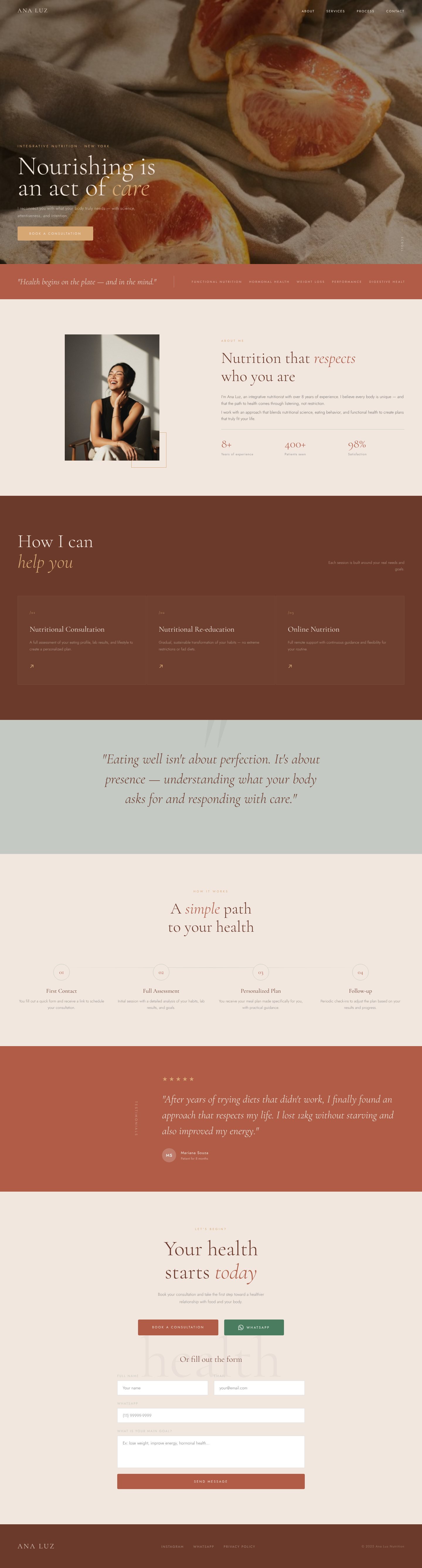
- A short introduction with a warm photo of you.
- Your main programs or ways to work together, each with a link to its own page.
- Two or three testimonials, with your clients' permission, about the experience of working with you.
- A few common questions answered simply, such as fees, insurance or how sessions work.
- The same main button again at the end.
None of this needs to be long. A calm page with clear sections is easier to read on a phone, which is where most of your visitors will see it.
A quick test you can do today
Open your homepage on your phone and look only at what you see before scrolling. Ask a friend who does not know your work to answer three questions: Who is this for? What does she help with? What would you click? If they hesitate on any of them, that is the part to rewrite first.
If you would like a homepage built around these answers from the start, take a look at our Website in a Day and one-page website options, or read how much a nutritionist should really pay for a website before you decide.
Questions nutritionists ask
No. Name the main way you help and link to a services page for the rest. A long list at the top makes it harder for a visitor to see themselves in your work.
It helps a lot. People choose a nutritionist they feel comfortable with, and a warm, natural photo answers the question "who will I be talking to?" faster than any sentence.
Lead with the group that brings most of your work, or the one you most want more of. Other groups can have their own section further down or their own page.
For most nutritionists, yes. It is a small, low pressure step, and it gives you the chance to explain your programs in person instead of asking visitors to commit to a package straight away.