
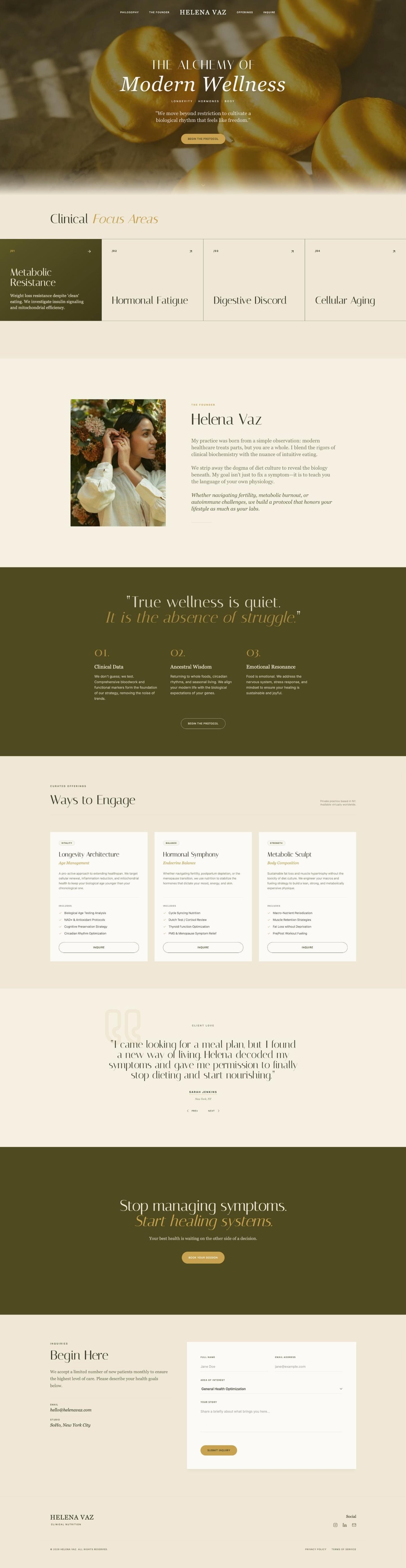
Someone finds your wellness website, maybe from a search, maybe from a friend's message. Within a few seconds they have already formed an opinion about whether you seem trustworthy, long before they read your story or your qualifications.
That first judgment is not only about words. Researchers at the Stanford Web Credibility Project, which studied how people judge websites, found that nearly half of the people in their research (46.1%) judged a site's credibility partly by its overall visual design. As the project's lead researcher, B.J. Fogg, put it, people do judge a website by how it looks.
The good news is that trust is not about expensive effects. It comes from a set of small, concrete details. These are the ones we check on every wellness website we design.
A real person, clearly visible
Wellness work is personal. Before someone books a session, a consultation or a class, they want to know who they will meet. A warm, natural photo of you near the top of the homepage answers that question faster than any sentence. Add your name, what you do and where you work right beside it.
The Stanford guidelines say the same in research terms: show that real, trustworthy people stand behind the site. A stock photo of a smiling stranger does the opposite. It tells visitors the site could belong to anyone.
Credentials explained in plain words
Your training matters, but a row of acronyms means little to most visitors. Write what each qualification means for them: "Registered dietitian, which means I am licensed to give medical nutrition advice" says more than three letters after a name. Put the essentials near the top of your about page and a short version on the homepage.
This also helps search engines and AI tools understand who you are, which supports how your site is found.
A design suited to the work
A wellness website should feel calm, not crowded. That means plenty of space around the text, a small palette of colors, two fonts at most and photos with natural light. The goal is not to look like a magazine. It is to look like a place someone would feel safe walking into.
Professional does not mean cold, either. The design should match the feeling of a session with you. A yoga teacher's site can feel airy and light, a therapist's site quiet and steady, an aesthetics studio's site polished and clean.
Speed and phones
Most visitors will see your site on a phone, often on a slow connection. Weave, citing a Mercury News report, says more than half of website visitors expect a page to load within three seconds and leave when it does not. Large uncompressed photos and too many plugins are the usual reasons a site is slow.
Open your own site on your phone and try to book. If you have to zoom, scroll sideways or search for the button, your visitors are doing the same, and many of them stop.
Contact details that are easy to find
The Stanford guidelines list this one directly: make it easy to contact you. A clear button to book or get in touch in the header, your email or phone, your city or service area and your hours. If you work online, say so. If you have an address, show it with a map link.
Hidden contact details make people wonder whether anyone is really there. Clear ones say you are open for business and happy to hear from them.
Fresh, accurate details
Few things lose trust faster than a site that looks forgotten: an old price, a class that no longer exists, last year's date in the footer or a broken link. The Stanford guidelines recommend updating content often and avoiding errors of all kinds, including typos and broken links.
You do not need to change the site every week. You do need to check it every few months and fix what has changed in your practice.
Trust is built in small details. A clear photo, a real price and a working button say more than any promise.
What to leave out
Some things quietly push visitors away, even on a beautiful site:
- Pop-ups the moment the page opens. Let people read first.
- Promises you cannot keep. Health and beauty claims need care, and a vague "life changing results" sounds less credible than a clear description of how you work.
- Too many choices. One main button, repeated through the page, is easier to follow than five different links.
- Busy backgrounds behind text. If the words are hard to read, the message is lost.
If you would like a site that gets these details right from the start, our Website in a Day builds a full page from one of our templates, and a one-page website is designed from scratch around your practice. You can see examples in our portfolio.
Questions about trust and design
No. It needs to look cared for and suited to its purpose. Clear text, real photos and a layout that works on a phone do more for trust than effects or animations.
If they are fixed, yes, or at least a starting price. A missing price often reads as a high one, and people rarely write to ask.
Check it every few months: hours, prices, photos and the year in your footer. Outdated details are one of the quickest ways to lose trust.
A few can work for backgrounds, but your face and your real space should appear somewhere. People want to see who they will meet.
A website that feels as calm and trustworthy as your work.
Website in a Day, from $497 (launch offer until Dec 31, then $697).
See the options