If you search for the best dietitian websites, you will find long galleries of beautiful sites. They are nice to scroll, but they rarely explain why those sites work, or which parts you should copy. A pretty site that does not bring clients is decoration.
When we look at dietitian and nutritionist websites that actually fill calendars, the same patterns appear again and again. Zipper, a platform built for dietitians, lists the features it considers essential in its guide to dietitian website design: clear navigation, a mobile friendly layout, strong calls to action, original photos, testimonials, helpful content and easy contact options. Below is how those features look in practice, plus what we add from our own projects.
The short answer: the best dietitian websites have seven things in common. A niche you understand in five seconds, programs with starting prices, one clear next step, real photos of you, trust shown the right way, content that answers real questions, and a site that is easy to use on a phone.
1. A niche you understand in five seconds
The best dietitian websites open with one sentence about who they help. "Nutrition support for women with PCOS, online across the US" works better than "Helping you live your healthiest life", because the right reader recognizes herself right away.
If you work with several groups, choose the one you most want to grow and lead with it. The others can live further down the page.
2. Programs with starting prices
Visitors want to know what working with you looks like before they write. Strong sites name each program or service, say who it is for, what is included and how long it lasts, and show a starting price or which insurance plans they accept.
A price on the page does not scare good clients away. It saves you discovery calls with people who were never going to book.
3. One clear next step
Zipper puts strong calls to action on its list of essentials, and we agree. Pick one main action, usually "Book a free 15 minute call", and repeat the same button at the top, after your programs and at the end of the page.
Several different buttons with different words make visitors hesitate. One clear invitation, repeated, makes the decision easy.
4. Real photos of you
Nutrition is personal. People want to see the person they will talk to about food, their body and their habits. Zipper recommends original images over generic stock photos, and the best sites we see use a warm, recent portrait, plus a few pictures of the space or of you at work.
Avoid the familiar stock image of a salad bowl and a measuring tape. It says nothing about you.
5. Trust, shown in the right way
Credentials matter: your registration, training and the areas you specialize in. Testimonials help too, and Zipper lists them as a key trust builder. Focus them on the experience of working with you, not on numbers on a scale, and follow the rules of your professional body.
6. Content that answers real questions
Many of the best dietitian websites have articles that answer the questions clients ask in first sessions. Zipper describes regular blog content as a way to establish authority, and it also gives Google many more searches to show you for.
The key word is regular. If writing every week is not realistic for you, our Rooted SEO service, opening soon, writes and publishes search friendly articles on your site, so your content keeps growing while you see clients.
7. Easy to use on a phone
Most visitors will meet your site on a phone, often between other tasks. Zipper lists mobile friendly design and simple navigation among the essentials. Text should be easy to read without zooming, buttons easy to tap, and your contact details on every page.
The best dietitian websites feel like a calm first conversation: who you help, how you work and how to start.
How to bring these ideas to your site
Open your current website on your phone and check it against the list. Does the first screen say who you help? Can a visitor see a starting price in under a minute? Is there one clear button? Is there a real photo of you? Fix the first gap you find, then move to the next.
If you are starting from zero, a single well organized page with these seven elements is enough to begin. We wrote more about the pages a health professional needs in our health coach website guide, and about the details that build trust in what makes visitors trust a wellness website.
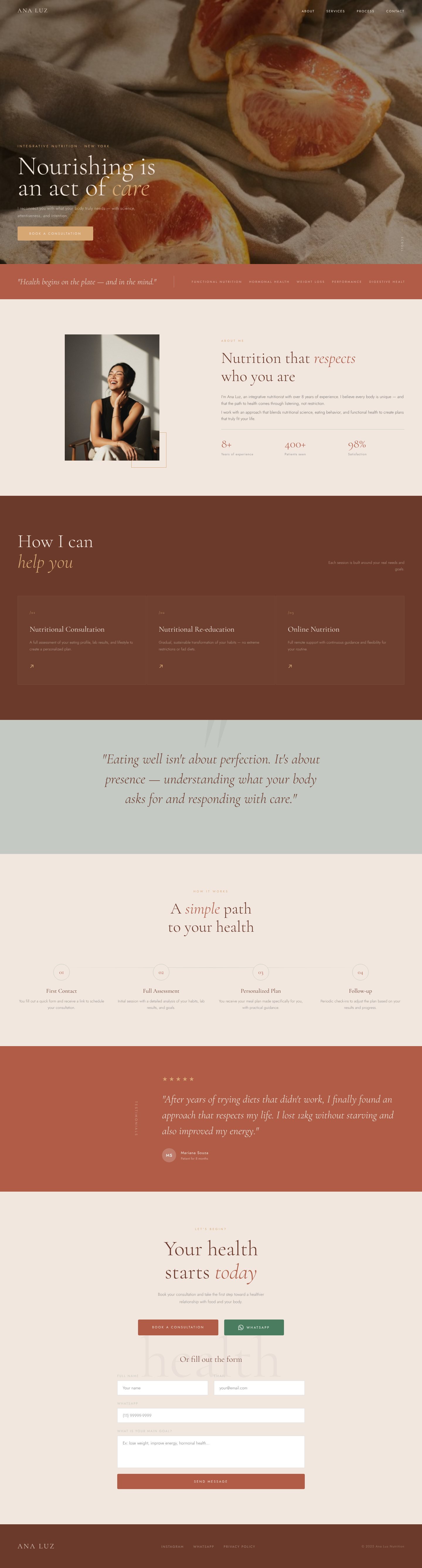
At Delas, Website in a Day builds a complete one page site for your practice from one of our templates, live in a day, and our one-page website is designed from scratch around your niche. You can see nutrition websites we designed in our portfolio.
Questions about dietitian websites
A homepage, a page for your programs or services with starting prices, an about page and a simple way to book. Many dietitians start with all of this on one well organized page.
Mostly of you. Zipper recommends original images over stock photos, and a warm, recent portrait near the top says more about you than a salad bowl and a measuring tape. Add a few pictures of your space or of you at work.
If you want Google to send you clients, yes. Pick the questions you answer most in sessions, like "what to eat with PCOS", and publish one a week. Each article is a page that can appear for that exact search. Our Rooted SEO service, opening soon, publishes them for you.
Show experiences, not numbers: a few lines, with her OK, about what working with you felt like and what changed in her routine. Leave out weight loss figures and before and after photos, which read as promises.
A dietitian website built around the clients you want.
Website in a Day, from $497 (launch offer until Dec 31, then $697).
See the options